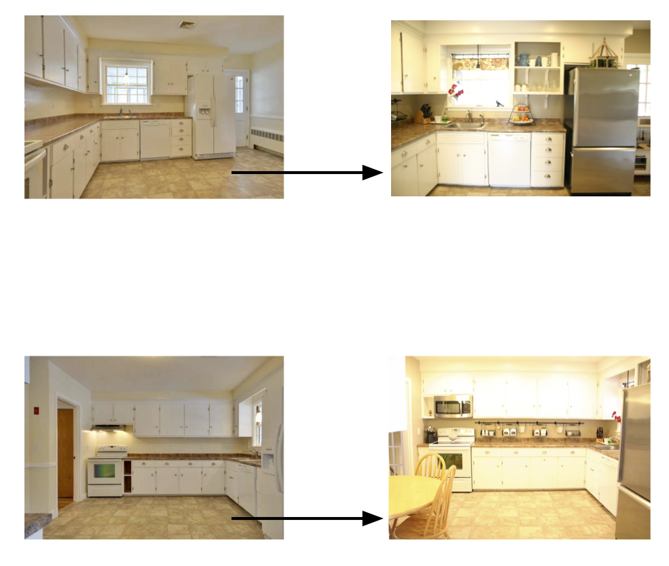
So my kitchen underwent a mini makeover. I told you a bit about what I wanted it to look like here. I found a crisp, clean white (I went with Benjamin Moore’s Simply White) that went with my cabinets and moldings and started painting. A couple coats later and my kitchen is bright and cheery. There is a lot of white but with only one window letting in natural light it can be a dreary room. The lights are always on if we are in the kitchen. The white helps add some brightness to the room. There is enough going on in the rest of the room to offset the white. I still have two or three more projects to complete in this room before I’m done. For now, of course.
Read MoreA while back I found a simple ceramic sign at Nordstrom Rack that would be perfect in my kitchen. Don’t you agree? I held off on putting it up for a little while. First of all I couldn’t decide where to put it. Over the doorway, which doorway, on the blank wall, over the sink? You see the dilemma. Then I was convinced that no matter where I put it, I would break it while putting it up. Do I use nails, do I screw it in, do I glue it on since I loved it so much and don’t see changing it for a while? Well I bit the bullet and installed it this morning. I decided on above the kitchen door leading to the front entryway. I screwed it in with black screws since hammering it in with nails would probably shatter it into a million pieces (I…
Read MoreWe are well into fall which means now is the time to bring out all the fun, cozy layers. Think throw blankets and runners. I’m at the Hooker Furniture blog today giving you some ideas of how you can do just that for each room in your home. See you there! via BHG
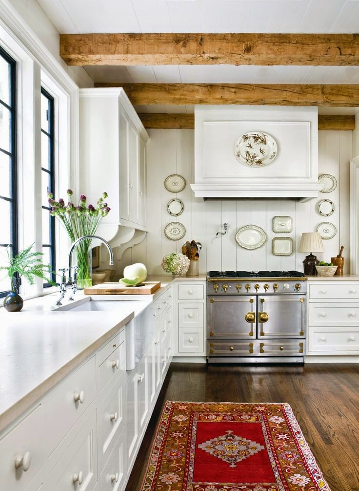
Read MoreLately I’m loving the look of rugs in the kitchen. I’m not talking about little mats in front of the kitchen sink. I also not talking about indoor/outdoor rugs that you can pull out to the back patio and hose off when they get dirty. I’m talking about RUGS, any type of rug, but especially old antiques. The vibrant colors and pattern make any kitchen look lived in… via Atlanta Homes Magazine via BHG via apartment therapy via bijou and boheme via blair harris via Elizabeth Anne Star interiors via decor happy via Garrison Hullinger via lane mcnabb interior design via lauren soloff via this old house via Maresca & Associates Architects via Peter Durham via the house diaries I’m currently not in the phase of life when this look is possible. I have a small area rug in front of my sink which is machine washable. As in “once a week because…
Read MoreSo things are moving along downstairs and there is actually an end in sight! I was telling myself that I might have a basement again by Christmas. I’m pretty sure I can now say I’ll have a basement again by Thanksgiving. Or else I just jinxed myself. Here is what it looks like now… A couple things had to change, which I’ll explain later. We were so happy with how the built in turned out the first time that we didn’t want to change it. The new sheet rock needs to be painted, along with the built in so that they are the same color. The contractor is coming back to spray the room and then install the floor. That is it! Thanksgiving, right?
Read MoreI’ve had people say to me, “What are you going to blog about when your house is done?” My house is always changing and evolving. I don’t mean to sound depressing but in my opinion a house is never done. I wouldn’t want it to be. If a house were done your home would be stuck in a one design time warp forever. No tweaking, no fresh coat of paint, no rearranging. That’s not how it works in my head. I’m always changing things around. That doesn’t mean I always start at the very beginning. I just add small things from time to time. My kitchen is the perfect example. It is the original kitchen to the house. One day I hope to renovate it. In the meantime I’m working with what I have. When we moved in we painted it. The floors were new, the counter tops had been…
Read MoreThe last few pieces that I added my own stamp to for my family command center were the menu list, to do list and small cork board… I used the IKEA Nyttja frames again for the menu list and to do list. I would be using them as an dry erase surface. I opened up the frames, added the same Target wrapping paper as the calendars and added a chalkboard sticker label on top of the wrapping paper. The wrapping paper ties all the pieces together without being too busy. For the menu I wrote the days of the week with the dry erase pen on the front. I’m then able to keep track of what I have planned when I go grocery shopping. I’m so forgetful when it comes to what I have on hand that a menu list reminds me of what I have ingrediants for. And yes,…
Read MoreWho doesn’t love, need, wish for, crave, or just plain want storage? How about a beautiful piece of storage furniture that enhances any room it is placed in? Joss & Main is giving away the Ada Storage Tower for just that purpose! The storage tower comes with four natural hand-woven baskets as well as four wood drawers. The apothecary-style metal handles and beautiful shade of gray make this a versative piece for any room in your home. Store office supplies in your office, hats and gloves in your mudroom, bathroom supplies in your bathroom or media accessories in your living room. The wood and metal Storage Tower measures 35 inches in height by 30 inches in width and 8.5 inches in depth. More information can be found here. Hurry and enter for your chance to win! Contest ends November 1, 2014 at 12 pm EST. Click on the link below……
Read MoreNow that the command center and banquette are wrapping up in the kitchen it has really started to come together. I still plan on changing out the pendant light above the table (as well as moving its’ location a bit). I’d like to build a table as well. This has been the plan all along. The table just doesn’t look right. A family member who will remain anonymous pointed out to me the other day that my table didn’t match my kitchen. Even when I changed out the chairs to the ones that will eventually be in the kitchen it still looks wrong. Of course there is nothing wrong with this look. Often it is done on purpose… via Casa Vogue via cottage modern via remodelista via coco cozy via placesettings I love this type of look. A little out of the box decorating. I could paint my table white…
Read MoreIn order to add calendars to my family command center I needed a couple things. First of all I was looking for a large enough calendar. With three kids I wanted them all to see what I was writing without using a 3 pt font. I wanted two months at a time each on a separate calendar so we could plan out the month ahead of us. I purchased two of the IKEA Nyttja frames measuring 19.75 x 19.75 each. This gave me plenty of room for the size calendar I wanted. Plus the Nyttja frames are so incredibly lightweight that they can be hung using 3M velcro strips. This came in handy as I was figuring out the exact layout of my family command center. I might have changed my mind on the arrangement two or thirteen times. As you might have guessed I couldn’t find a big enough…
Read More
Subscribe to Posts
Thanks for subscribing!
A Little History
Blog Policies
For more information on all blog policies regarding comments, advertising, copyright, sponsored links, guest submissions, and other matters, please look here.


